Deploying WebMaps and Interactive Charts to Better Contextualize Risk Information
When we hear on the radio about the 2022 European heatwaves or see live reporting from a recent earthquake-affected area in the Philippines, it can be difficult to fully understand the scale, the magnitude, or the frequency of such disruptive events. Mapping out such events on by using zoomable, interactive web maps can bridge this cognitive gap and answer some of the reader’s most pressing set of questions.
If feasible, it’s important to find methods for connecting accessible but technical datasets with the everyday lives of potential readers’. This is because this type curiosity and the act of discovering such insights can help the reader answer some of the immediate concerns he or she might have about a given risk that could be potentially disruptive.
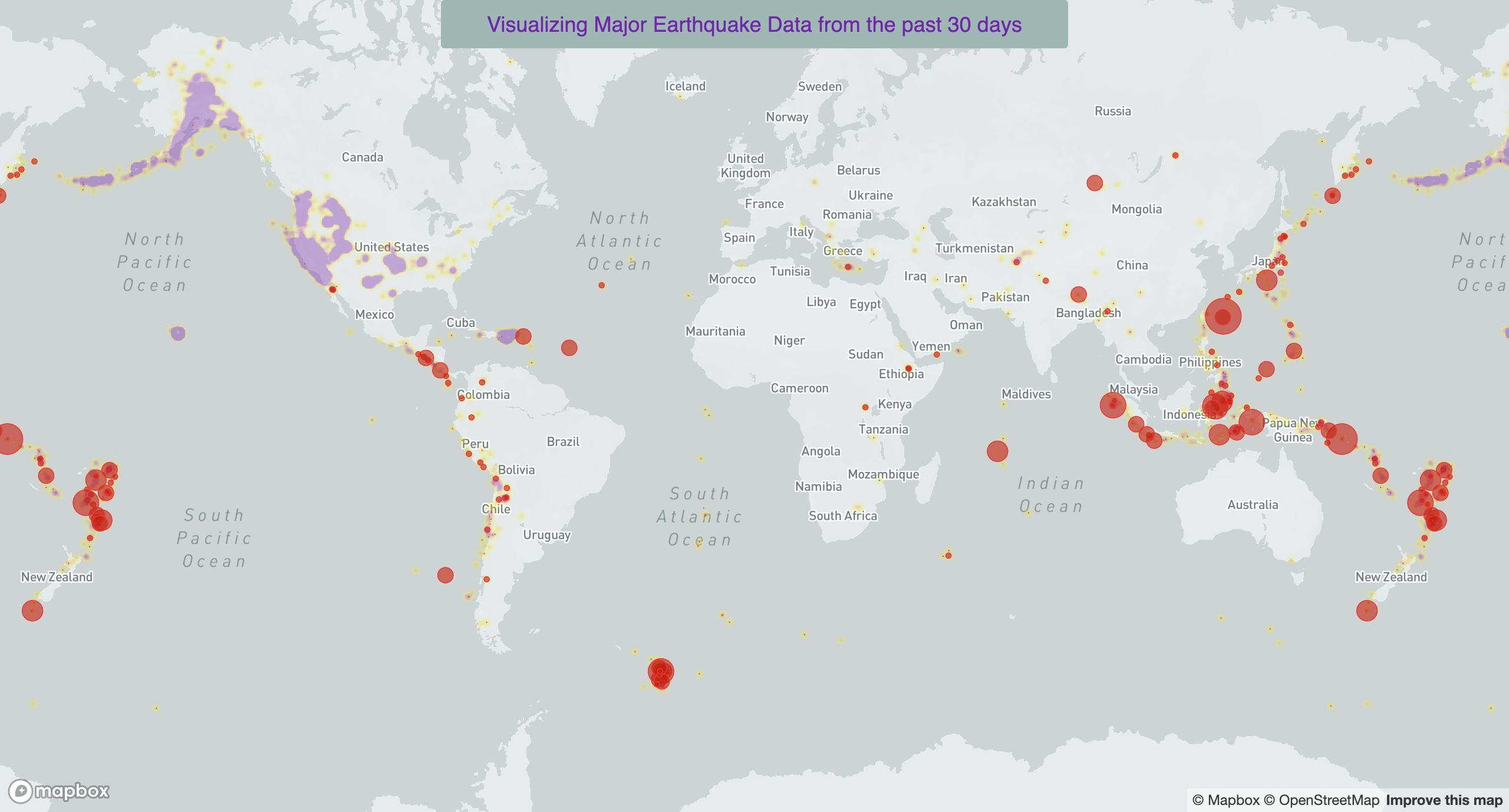
Visualizing Major Earthquakes Data Around the World (Nov 2021)
Mapbox (Mapping + Annotations)
This geovisualization provides a snapshot of significant earthquakes (high levels of magnitude) that occured November 2021 around the world.
The intent was to provide comparators for each data point. The reader can make sense of these events by looking at: (1) their annual frequency for a given magnitude level event, and (2) anticipated effects on the built environment (estimates).
NB. USGS considers "significant earthquake" as events that are determined by a combination of magnitude, frequency of "Did You Feel It" feedback responses, and PAGER alert level.
For more information about USGS significance level calculations: click here.
South Sudan = one of the most vulnerable countries to disasters in the world
DataWrapper (Mapping + Annotations)
This interactive scatter plot illustrates why South Sudan - due to its small population and lower media visibility - is a forgotten country when it comes to comparing country's ability to manage and withstand disasters (in particular river floods).
Clicking on the blue button allows the reader to examine why river floods is a growing and significant challenge for the country's socio-economic development.
NB. Data for both charts was provided by the European Union's INFORM Index and World Resources Institute (River Flood Risk Comparison).
Explore River Flood Risk Comparator
Explore Recent Trends on INFORM Risk Index
World Resources Institute
INFORM Risk Index
All European cities are getting much warmer since 1960
DataWrapper (Mapping + Annotations)
The map shows the regional warming since 1960, for selected European cities, as calculated by Berkeley Earth. The temperature change appears in °C/century. The circle size shows each cities' population.
NB. For all shown cities, Berkeley Earth doesn't compare the average temperature of only 1960 with the average temperature of only 2018, but the average temperatures calculated over a century.
Using sub-national data to quantify climate warming across Europe
DataWrapper (Mapping + Annotations)
The data source used was the UERRA regional reanalysis for Europe on single levels from 1961 to 2018, created by Copernicus and by the European Centre for Medium-Range Weather Forecasts (ECMWF).
NB. The unit of analysis NUTS level 2 - which stands for "Nomenclature of Territorial Units for Statistics" which is a geocode standard for referencing the subdivisions of countries for statistical purposes by the EU.
Tools & Datasets
- HTML5, CSS & Javascript
- MapBox
- DataWrapper
Datasets : annotated within each WebMap.